As of August 1, 2019 we’ll be turning off one of the most used features in envisage.
You may wonder, “Why would we do such a thing?”
This article will give you some background insight into what it takes to build a powerful online app used by thousands around the world.
A Connected World
For the first time in the history of computers, software and technology, the tools we use everyday can be changed or removed without our permission. This is something new.
Apps, computers, smart phones — these things constantly get updated and suddenly features are gone or changed.
That never use to happen. Imagine 20 years ago, someone coming into your home and changing the knobs on your TV during the night and the next day you have no idea how to turn it on.
Today it happens regularly. Even the Tesla car performs a software upgrade wirelessly, adding and changing new features. (Yep, the car is like a giant app on wheels).
But why all this change?
When you start using an app there is always a learning curve working out what to click or tap and how to set things up.
After a while, you get used to using it and you’re familiar where the buttons are. Life is good.
And then suddenly, they change it!
I find this frustrating, as I’m sure you do too.
Often the apparent changes are nothing more that an upgrade in colors and design.
When this happens, I use to think to myself, “What a waste of time, why didn’t they just leave it as is?”
You know that old saying, “If it ain’t broke, don’t fix it.”
Unfortunately apps can’t be left alone, even if they do work “as is.”
There are many background issues that create the need for change.
Envisage is an 8 year old app. As a statistical graphing app it is no surprise its most popular feature was our Graphs view as shown below.
Over the past 8 years, we’ve invested a huge amount of time and money upgrading envisage to cater for unlimited users with unlimited organizations, with the goal of providing the easiest and most powerful data analytics app available.
To do this required that the code be built from the ground up, as the existing code was not stable enough to build our brand new big app.
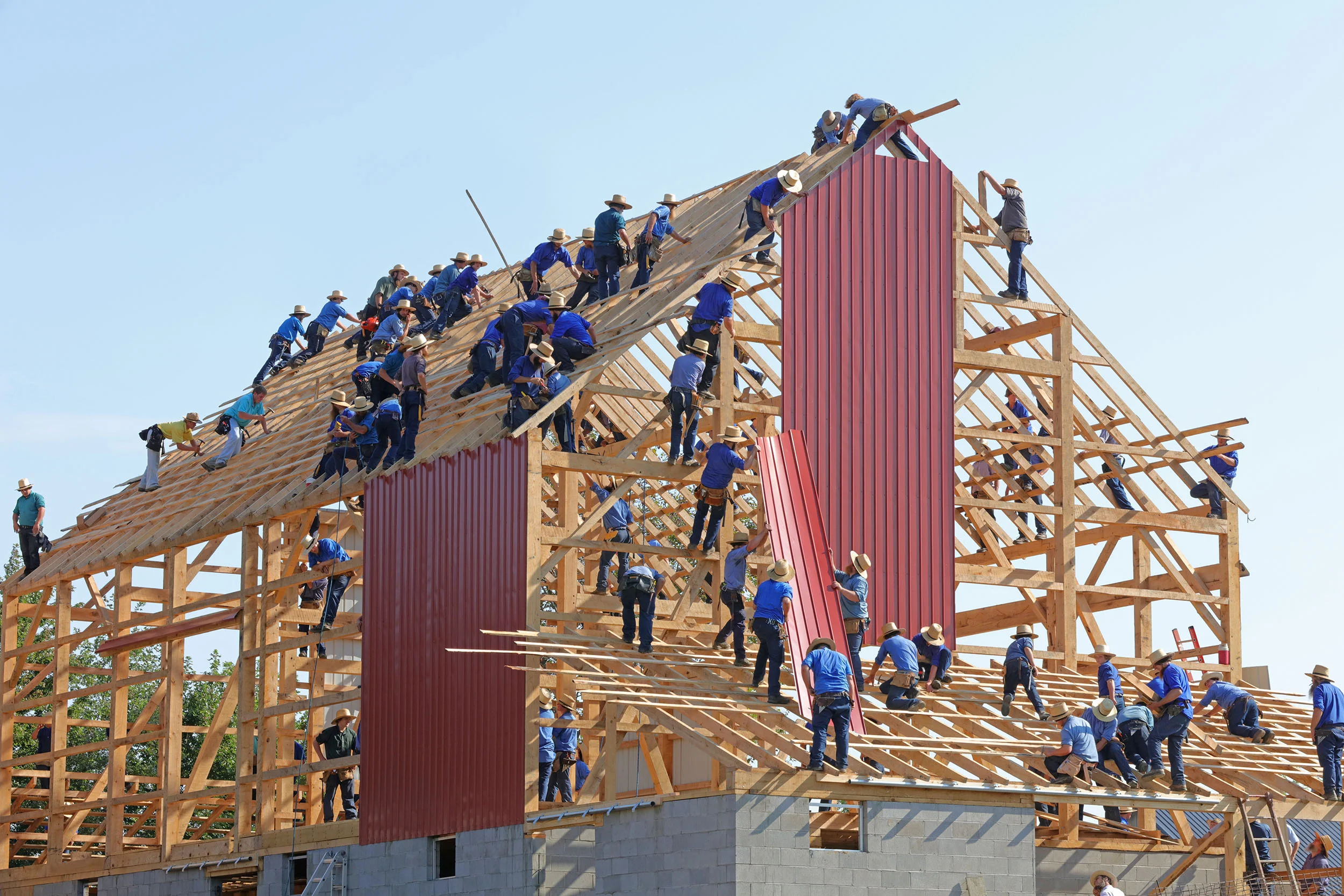
As a simple analogy, consider an old building with unsteady foundations, it would be unwise to build a skyscraper on top of it.
Instead we found new land and created the ideal foundations for the “new building." At that time, we left our current users in the “old building.”
envisage
New from the ground up
While creating the “new building”, we took a look at the “old building” to see how people were using it and what features they liked. We made sure we put them in the "new building.”
When new users joined, many naturally migrated to the newer features. After all, they were easier to use, faster and more intuitive.
But the “old users” continued to use the features they were familiar with.
Then comes the day where we condemn the “old building” and show the tenants the new place we’ve built.
Some move over willingly and love it.
Some are a little frustrated but take the time to figure it out and eventually agree it was a good move.
Some decide it’s all too hard and go find another place to live.
The New Graphs
The New Graphs has tonnes of features. It’s faster, built with better code and will enable us to integrate Organizing Charts, OKRs and a section for Company Policies.
It is the foundation of our brand new app that allows us to create the vital tools every business owner needs to achieve their goals.
We built it for you.
We hope you like it.
You are free to move in anytime. Check it out for free here.
Comment and asks questions below or ask questions privately.
And hit the heart if you like it.


